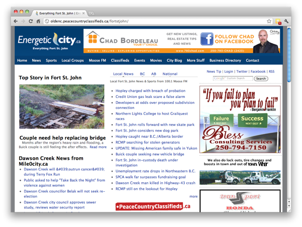
I have always known people don’t like much change, but I never thought it would be to this extent. No one has died but there’s been some pretty nasty words exchanged. Let me try and explain my thoughts.
I wasn’t sure how I was to write this post, or if I was going to write it at all. I keep saying in my mind saying we should be the bigger person and just ignore all the bad stuff, which we do for the most part and we don’t let it bother us. What I do want to point of this post is just some key points about websites and one specifically.
If you haven’t guessed already this post is about the new energeticcity.ca. Last week we relaunched the site in the new format. I would like to point out here that the new format for energeticcity.ca is the exact same as the recently launched mile0city.ca, which people love.

The above picture is of course the old energeticcity.ca and below is the new one. So let me just compare them for a second. The old energeticcity.ca, to me, has always felt cluttered. I don’t know anything about any of the stories other than the top story. I have to actually click on each story to see the content of it. Now if you look below at the new energeticcity.ca and you actually scrolled through the site you’ll see that you get snippets of each story. And to all those naysayers who say we have now got more ads on the site, I’d like to personally point out that you can see more ads on the old site than can on the new site, above the fold.

While I still do believe there is lots of work to be done to the new energeticcity.ca, I don’t think it is complete garbage, at all. What many people don’t see, which was a big part for us, is how the site is actually built. All the content including images, articles, contributors, etc. are all connected and compiled a large database for easy reference. Did you know we can actually post one-story that get published on both mile0city.ca and energeticcity.ca. While this isn’t a big selling point for the end-user, it cuts down on our workflow time, which in turn will allow us to do more and be more in the community.
The last thing I want to point out about the new energeticcity.ca is the tabs on the homepage. You have All, News & Sports, Groups & Blogs, BC & National News and Weather. Each of these different tabs has different content. One of the things that I’m toying with in my mind, is making the news and sports tab have a list of the latest news stories and cutting out the teasers, but I’m not the decision-maker.


Now I would like to point out two news style websites that get at least 10 times the traffic that energeticcity.ca does. First is the Huffington Post and if you look at their homepage you will notice that there’s not a lot there. There’s no list of news stories and actually has no ads. It’s so basic, you have no idea what other content they have on the website.
Then there is Mashable.com, which is always changing their site. If you look at their homepage you see 4 different ads before you ever see any content. And it is all very scattered, I don’t actually know where to look first. I assume their top story is on the left, but is also so much going on I’m not sure where I should click. The top story is actually similar to the energeticcity.ca one, so we must be doing something right.
I’m not trying to bring emotion into this launch, but I myself am trying to understand why people are so against a layout that is so successful in Dawson Creek. I’m also trying to understand why some reader feel it necessary to send one line emails that say “you really fucked this up.” I’m curious to know how they would feel if I came and told them this about something they put a lot of time into.
What do you think? How do you think we did with energeticcity.ca is comparison to other sites. I’m hoping for constructive responses so we can understand more about how our sites are used.